Group Planning on Airbnb
Case Study
Overview
A hypothetical feature on Airbnb to support group travel by consolidating group messaging and split payments, in-app.
The project fulfilled Designlab's Add a Feature assignment.
Role
UX/UI Designer
Timeline
2.5 weeks
User Flows
User Research
Prototyping
Wireframing
Problem
Airbnb connects travelers with unique short-term rentals around the world, offering an experience that goes beyond traditional hotels. However, while users can share wishlists, the platform falls short when it comes to supporting group travel planning—an area where collaboration is essential.
This project explores how Airbnb could better serve group travelers by introducing tools for shared decision-making, cost-splitting, and logistics coordination.

Research
This research focused on understanding the unique challenges groups face when planning travel together. Specifically, what makes the process frustrating, what tools people currently rely on, and where collaboration tends to break down.
My hypothesis was that group travelers struggle most with coordination—particularly around decision-making, cost-sharing, and keeping everyone aligned. With research, I aimed to uncover pain points in current planning workflows and identify opportunities for Airbnb to better support group travel with more collaborative, built-in features.
To investigate this, I used three primary research methods:
Competitive Analysis (SWOT)
User Interviews
POVs & HMWs
User Flows
Competitive Analysis
The SWOT analysis focused on Booking.com, Vrbo, and TripAdvisor. These companies were chosen for their relevance to Airbnb’s product offerings:
Booking.com
Strengths: Booking.com offers a fast, frictionless checkout experience and access to a wide range of accommodations, including hotels and short-term rentals. Its variety of filters and clear pricing make it easy for users to book quickly, and without having to create an account.
Weaknesses: It lacks tools for collaborative planning—users can’t vote, comment, or organize shared wishlists—making group coordination feel disjointed and manual.
Strengths: Vrbo excels at large-group vacation rentals, offering spacious homes that cater well to families and friend groups. Its focus on full-property rentals makes it appealing for those seeking privacy and/or a place to convene as a group.
Weaknesses: Despite being group-focused, it doesn’t offer tools for collaborative planning (i.e. no shared lists, in-app communication, or cost-splitting features to simplify group decision-making).
Vrbo
Strengths: TripAdvisor is a trusted resource for reviews, rankings, and travel inspiration. Its site is a one-stop shop for users to book, and discover destinations, or attractions. It’s also widely used for travel research, in terms of planning things to do in an area.
Weaknesses: It’s also not built for real-time collaboration or organizing plans with a group.
TripAdvisor
Key Insights
Booking.com excels at fast, frictionless booking; Vrbo is a go-to for large-group accommodations; and TripAdvisor serves as a trusted hub for travel inspiration and reviews.
Despite their individual strengths, none of these platforms provide a fully integrated or collaborative planning experience for group travel. This gap revealed a compelling opportunity for Airbnb to expand its value proposition by:
Pulling group travelers from Vrbo with built-in tools for coordination and decision-making
Differentiating from Booking.com by blending social features with logistics
Reducing dependence on third-party tools like TripAdvisor and Reddit by centralizing planning, discovery, and booking in one place
These findings validated the need for group planning features—positioning Airbnb to support not just where people stay, but how they travel together.
User Interviews
To understand user pain points and common tools they used to collaborate group planning, I interviewed six people (ages 24–30) who had recently planned group trips. Each person walked me through how they coordinated with friends—from choosing a place to stay, to figuring out the budget, to planning daily activities.
“We had six people planning everything in a group chat… then using three different apps to track money. It got chaotic.”
Key Insights
While the excitement of the trip was clear, so were the headaches. Logistics were scattered across chaotic group chats, shared costs were either tracked in separate apps or unfairly fronted by one person, and key decisions often stalled due to a lack of structure or ownership. These interviews surfaced the friction points that make group travel stressful—and highlighted a clear opportunity for Airbnb to support not just where people stay, but how they plan together.

Cost Splitting
Most users turned to third-party apps like Splitwise or Venmo to divide expenses. This extra step created friction and confusion—highlighting a clear opportunity for Airbnb to centralize payments within the platform.

Planning Support
While users were excited to explore new places, they often felt overwhelmed when choosing where to go or what to do. There was strong interest in having curated recommendations—especially if they could be saved and voted on within the group.
Communication
Group iMessage threads were the go-to for coordinating plans, but quickly became cluttered and hard to follow. Users craved a more centralized space to make decisions—something Airbnb could support.


App-Switching Fatigue
From messaging and booking, to payments and itinerary planning, group travel required juggling several different apps. This constant switching added unnecessary stress—showing the need for a more unified, seamless planning experience.
Research Synthesis
After reviewing insights from user interviews and the competitor analysis, I created a series of POV and HMW statements.
This synthesis helped reframe the research findings into clear, actionable opportunities for design. It clarified not just what group travelers struggle with—but how Airbnb could step in as a collaborative, end-to-end planning companion.
POV
As the default planner in my friend group, I’m overwhelmed by coordinating logistics, aligning preferences, and tracking expenses across multiple tools.
HMW
Reduce app-switching by centralizing planning, communication, and cost-tracking in one place?
POV
As someone who values where I stay and what I do, it’s inconvenient to leave Airbnb and search elsewhere for trusted local recommendations.
HMW
Pull users from our competitors by enticing them with a more robust collection of exclusive booking functionality?
or
Combine the emotional appeal of Airbnb’s stays with curated planning tools to keep users engaged and inspired?
HMW
User Flows
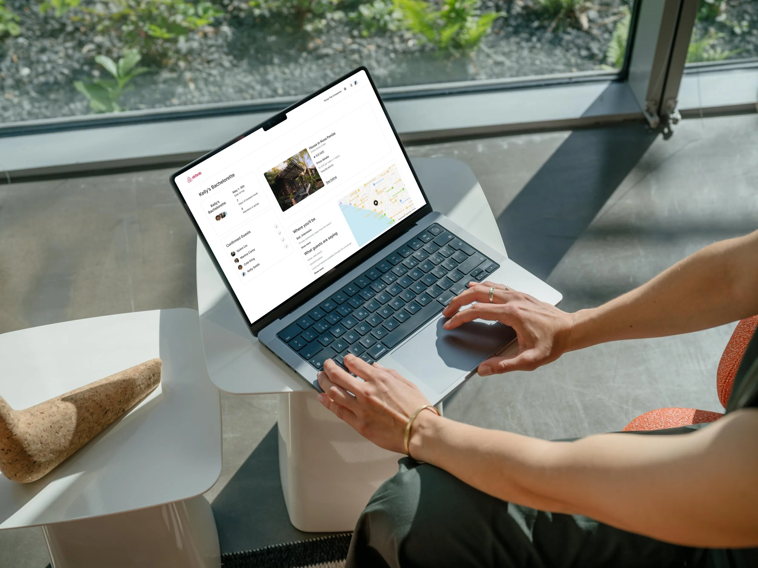
This user flow brings the Airbnb Group Trip Companion concept to life by imagining what it would look like to plan a trip collaboratively—without ever leaving the app.
It outlines a streamlined journey where one person initiates a group trip, invites friends to join, browses potential stays together, and then splits the cost once a decision is made. Features like group chat and built-in payment tools make coordination feel seamless.
The importance of this flow lies in its ability to address key friction points uncovered in user research, such as: scattered communication, unclear cost sharing, and the hassle of switching between apps. By centralizing these actions, Airbnb could become not just the place users book their stay—but where they plan the entire experience together.
Design
The design phase of the Airbnb Group Travel Companion began with a fundamental question:
How might we make planning a group trip feel collaborative, organized, and stress-free?
This question shaped every design decision—from envisioning how a user might share a stay they found, to mapping user flows that simplified splitting the cost of the stay with friends. Early wireframes focused on keeping the process clear and focused, while reducing the need to jump between apps or chase down payments.
As the experience took shape in high-fidelity mockups the visual design reinforced a sense of ease and clarity, helping reduce the typical chaos of group travel planning.
Usability testing added an additional layer of insight. It revealed where interactions needed more guidance, how visual hierarchy could be improved, and what features resonated most with users.
Low Fidelity Wireframes
At the heart of the design were three essential features: group messaging, built-in cost-splitting, and a centralized trip hub. These designs were prioritized because they addressed real frustrations uncovered in user interviews.
Each screen was chosen with purpose.
Group messaging offered a way to keep decisions in one place - preventing scattered conversations
Cost-splitting simplified awkward payment tracking across apps.
The trip hub served as the connective tissue—bringing together travel dates, group members, saved listings, and activity ideas into one cohesive space.
To avoid scope creep, the wireframes focused only on the most impactful interactions: group messaging, browsing stays, and dividing costs. Features like group polls or trip date selection were explored during the user flow stage, but ultimately set aside to keep the design focused within the project timeline.
In narrowing the scope, the designs were able to stay grounded in user needs while remaining actionable.
High-Fidelity Wireframes
The high-fidelity designs brought the vision into sharper focus, layering Airbnb’s familiar branding with a new set of tools tailored for group travel. Each screen—from the expense calculator and in-app messaging—was crafted to feel like a natural extension of the Airbnb experience. These features were prioritized not just for aesthetics, but for impact—reflecting the real pain points users voiced around disorganized communication and awkward money conversations. By anchoring the designs in user feedback, the result was a more seamless, intuitive, and collaborative.
Usability Testing
To see how the feature would be received, I conducted usability testing with five participants. Each person was asked to reserve a stay mentioned in the group chat and split the cost—tasks that mirrored real group planning scenarios.
What Worked
Users appreciated the familiar Airbnb look and feel, and found it easy to browse listings and engage in group chat. The centralized planning hub also made it easier to keep track of trip details in one place.
What Didn’t
Only 60% were able to complete the full booking and cost-splitting flow. Many got stuck after sending an auto-reply in the chat, unsure of what came next. This moment of confusion showed a need for clearer prompts and stronger guidance throughout the flow.
Revisions
To address these gaps, I introduced more obvious calls to action and reworked labels to support forward momentum. I also elevated the visibility of the split-payment feature—making it easier to understand, access, and trust. These changes aimed to reduce friction and better support the very collaboration this feature set was designed to enable.
Final Iterations
Updating the split-payment process became a top priority because it came up consistently in user feedback. During testing, many people felt uneasy about the feature—it lacked context, which made the entire checkout experience feel unclear.
To fix this, I integrated the cost-splitting directly into the main payment flow instead of treating it like a one-off decision. To keep things digestible and avoid cognitive overload, I broke the process into multiple screens, following a pacing and layout style similar to Airbnb’s existing flow.
In the initial design, users were presented with two options at checkout: “Pay Total” as the primary button and “Split Cost” as a secondary option. This hierarchy unintentionally pushed users toward paying in full, and the split option lacked transparency and flexibility.
Original design


Updated design


The payment screen shows three equally weighted options: pay in full, split with others, or pay with Klarna.
If users chose to split the cost, they could then select who would be contributing. The updated flow also included a double-confirmation screen that clearly outlined who would be charged and the exact amount for each person.
These updates helped create a calmer, more focused experience, especially during high-stakes moments like confirming payment.
Final Thoughts
This project was a meaningful step in my growth as a UX designer. I gained confidence in the visual design process, especially through practicing UI iterations. I also learned some important lessons—particularly around scope management. I found myself veering away from my original user flow and trying to do too much, which impacted both my timeline and file organization.
A major takeaway from this experience is the importance of staying within scope and managing time effectively. Iteration is valuable, but setting clear boundaries is essential to avoid overcomplication. Going forward, I’ll approach projects with a stronger awareness of when to scale back in service of clarity and usability.